Logo & Identity Work
Marks for local businesses, disc golf clubs and retailers, and a couple of software companies. Mostly Illustrator, mostly one-color-first so they work in embroidery and vinyl.
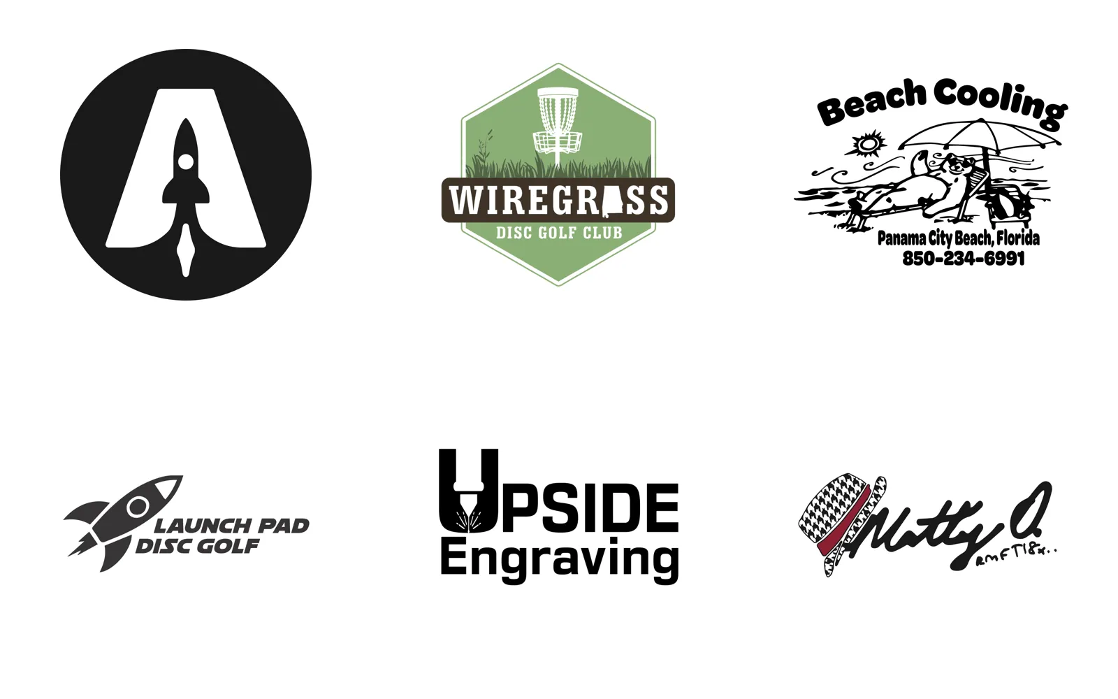
Most of these started the same way: someone in the disc golf community or a local business needed a mark, had no budget for an agency, and had a truck door, a jersey, or an embroidered hat waiting for it. That last part shapes everything. A mark that only works in full color at 400 pixels isn’t a logo for these clients. It has to hold up as a single color cut in vinyl, stitched at two inches, or printed in black on a sponsor sign.
So the process is usually one-color first, then color. Ascendant’s rocket sits inside the counter of the A because a rocket next to an A falls apart at sticker size. Wiregrass gets a hexagon badge because a badge embroiders better than a loose illustration. Beach Cooling is a hand-drawn cartoon because the owner wanted to look like the friendly local shop he is.
The software marks, BuyerSphere and PartnerChord, came out of the same Illustrator habit applied to product work: a mark, a wordmark, a reversed version, and the sheet that shows them together so nobody picks the wrong one.
The Bay County Disc Golf, Root for Bay, R2 Realty Restoration, Majette Owl, and Northwest Florida Championship marks each have their own page.
Ascendant Disc Golf. The rocket lives in the counter of the A so the mark works at sticker size.
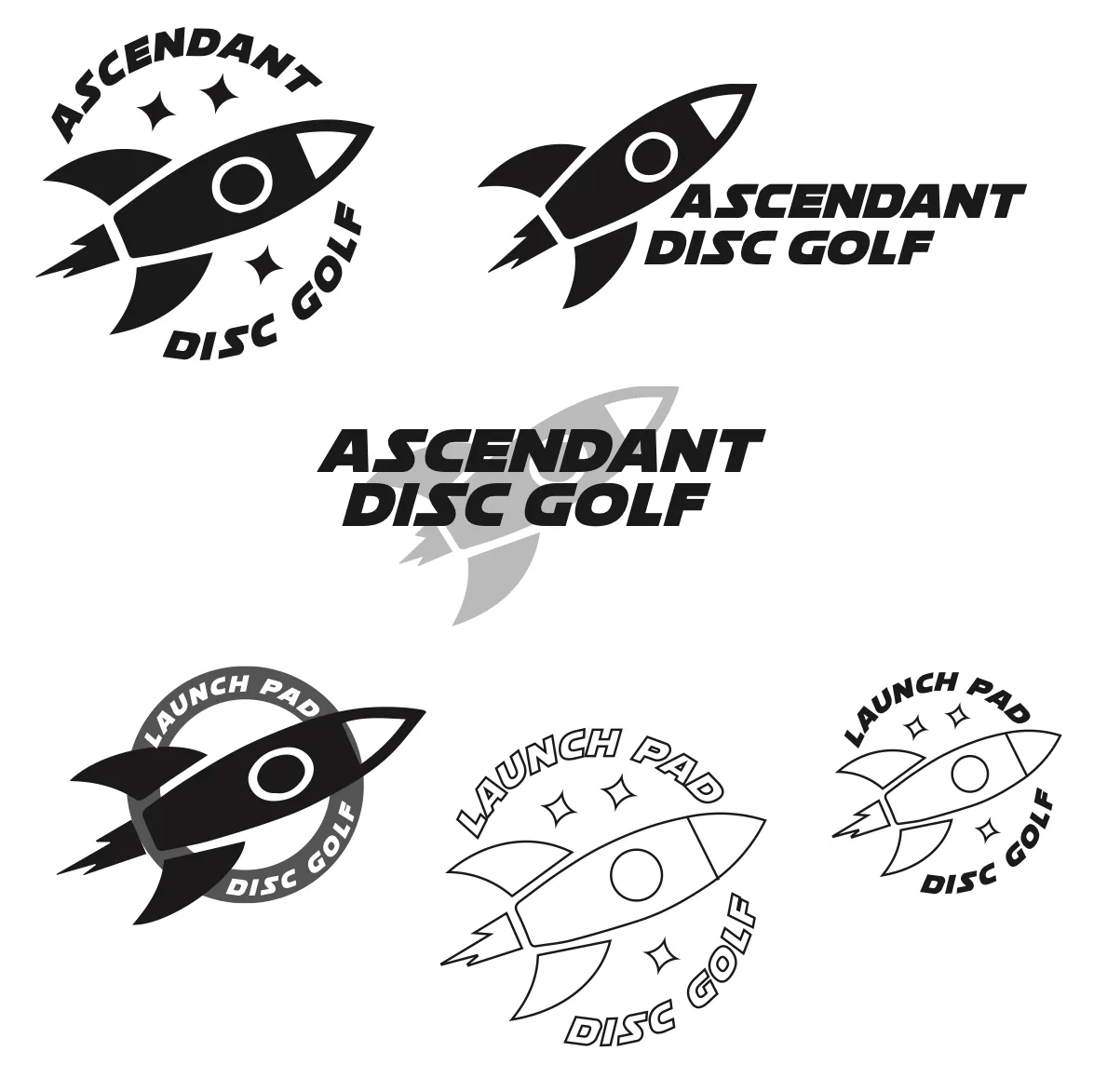
The exploration sheet behind Ascendant and its sister brand, Launch Pad.
Launch Pad Disc Golf.
Wiregrass Disc Golf Club. The basket sits in the grass the region is named for; Alabama stands in for the A.
Beach Cooling, an HVAC company. Drawn to read as a friendly local shop on a truck door.
Bay Builders. Wordmark exploration, ending in the B with a palm and a hammer.
Upside Engraving.
Matty O. A signature mark, with the hat doing the identification.
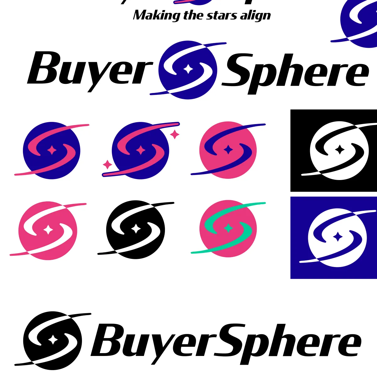
BuyerSphere. The swirl mark across its color and reversed variants.
PartnerChord. Tagline variants for a partnerships product.
Christo's Sports Bar & Grill. A marlin over a golf ball for a sports bar that also sponsors the club.
Koep Corp. A brushed circle around the monogram, delivered in color, black, and reversed for print.
Defunk Disco. Seventies bubble lettering for a disc golf team, in color and one-color.
The one-color version, which is the one that actually gets printed.
Bay Med Resort & Spa. A resort crest with a medical cross where the monogram would go.
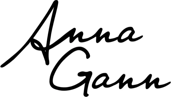
A signature mark for Anna Gann, in stacked and linear versions.
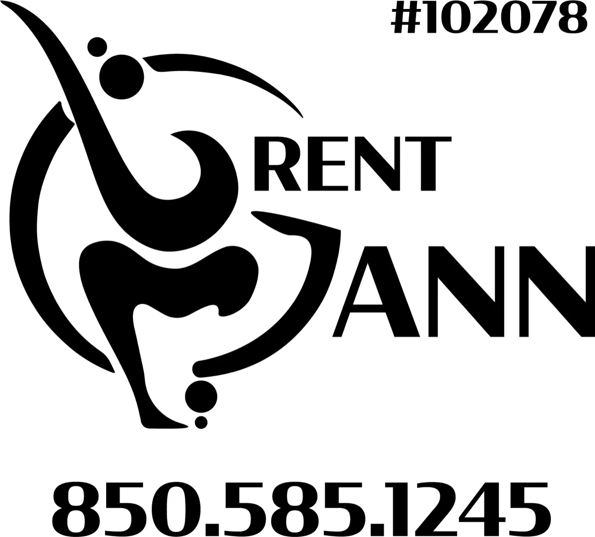
My own mark. A thrower's follow-through as the B and G.